• *From August to December 2025, I had the great opportunity to participate in a Work Study program with the Veterans’ Administration History Office. I had the opportunity to work closely with working historians and contribute to several feature stories about VA history. It was a great experience and while I wait for some administrative things to iron themselves out, I hope to start working with the VA history office again shortly. In the meantime, I’ll post the work I produced last year. Enjoy!

    On the morning of October 3, 1871, President Ulysses S. Grant arrived in Dayton, Ohio, on the overnight train from Chicago, Illinois. After meeting with Dayton Mayor J.D. Morrison, he took a horse-drawn carriage to visit Veterans at the Central Branch of the National Home for Disabled Volunteer Soldiers (NHDVS). Grant was met by the Veterans of the Home with “tumultuous enthusiasm which seemed to know no bounds” and delivered short remarks thanking them for their service.[1] Grant later hosted the NHDVS Board of Managers at the White House in December 1871 where he spoke warmly about the Dayton Central Branch’s management and his desire to visit other NHDVS sites, although it is unclear if he ever did.[2]

    President Grant, pictured here circa 1866, was the first U.S. President to visit a branch of the National Home. (Library of Congress)
    President Grant, pictured here circa 1866, was the first U.S. President to visit a branch of the National Home. (Library of Congress)

    President Grant became the first post-Civil War President to visit a branch of the NHDVS, a group of homes established to care for wounded Civil War Veterans. The establishment of the NHDVS was originally signed into law by President Abraham Lincoln in March 1865, and the first NHDVS branch opened its doors in Togus, Maine, in 1866, followed by both the Central Branch in Dayton, Ohio, and the Northwestern Branch in Milwaukee, Wisconsin, in 1867. More NHDVS sites opened in the following decades. These National Homes were often key stops for Presidents during their tours across the Nation, bringing out large crowds.

    President Rutherford B. Hayes, also a Civil War Veteran, succeeded Grant in March 1877. In September of that year, Hayes returned to his native Ohio to dedicate the Soldiers Monument at the Central Branch in Dayton. Received at the National Home by a 21-gun salute, Hayes inspected the Veterans living at the Home, after which an estimated 15,000 people gathered to watch him unveil the Soldiers Monument. The event did not go exactly to plan; the cord Hayes pulled to remove the memorial’s canvas broke, resulting in a delay while a 40-foot ladder was retrieved to finally unveil the monument.[3] Yet, after the unveiling, Hayes gave a short speech memorializing the deceased comrades of the Civil War and noting that many Veterans in the crowd were “victims of that war,” missing limbs and abilities that “enable men to succeed in life.” In addition to the Central Branch, Hayes also visited Veterans at Milwaukee’s Northwestern Branch in 1878, where he shared stories about his service with the Union Army.

    James Garfield, the third Union Civil War Veteran to become President, succeeded Hayes and took office in March 1881. Three months later, Garfield sailed to Hampton, Virginia, on the presidential yacht, the U.S.S. Despatch, to visit Veterans living at the Southern Branch of the National Home. Accompanied by the branch’s governor, P.T. Woodfin, Garfield inspected the Veterans of the Home before visiting the nearby national cemetery and attending church at Bethesda Chapel. He returned to Washington, D.C. later that day.[4] It’s not clear if Garfield visited other National Homes before his death later that year.

    This Soldiers Monument at the Dayton National Cemetery was dedicated in 1877 by President Hayes. (Library of Congress)
    This Soldiers Monument at the Dayton National Cemetery was dedicated in 1877 by President Hayes. (Library of Congress)

    President Grover Cleveland visited the Milwaukee National Home as part of his Midwestern Goodwill Tour in October 1887.[5] Thousands of people lined Grand Avenue as Cleveland and his presidential party took a carriage from the Plankinton House hotel to the National Home. Veterans of the Home saluted Cleveland as he drove through the grounds, cannons firing in presidential salute.[6] In July 1888, near the end of his first term in office, Cleveland signed legislation establishing another NHDVS site in Marion, Indiana.[7] However, dealing with an economic depression and several significant labor strikes in his second term, there is no record of Cleveland visiting any other NHDVS sites.

    President William McKinley, the last U.S. President to serve in the Civil War, made several visits to NHDVS branches during his presidency. McKinley visited Milwaukee’s Northwestern Branch on his Western Tour in October 1899. Milwaukee’s streets were filled with thousands of school children hoping to catch a glimpse of the President as he drove by. When McKinley arrived at the Northwestern Branch, a 21-gun presidential salute was fired by the First Light Battery of the Wisconsin National Guard. McKinley toured the grounds of the National Home and gave a short address to the resident Veterans.[8] In May 1901, McKinley also visited the Pacific Branch in Los Angeles, California. He arrived at the National Home by electric car and spoke as a comrade to the Veterans, saying that there “is no relation, except that of home and family, so close and intimate and sacred as that of comradeship in war.”[9]

    President McKinley gives a speech at the Pacific Branch in 1901. (Library of Congress)
    President McKinley gives a speech at the Pacific Branch in 1901. (Library of Congress)

    After McKinley’s assassination in 1901, Theodore Roosevelt assumed the presidency. Roosevelt’s first visit to a National Home was in April 1903 when he traveled to the Northwestern Branch in Milwaukee. Greeted by Milwaukee Mayor David S. Rose, Roosevelt and his party were driven to the National Home where he inspected its 2,000 Veterans.[10] After his inspection, Roosevelt gave a reverential speech to the Veterans, lauding them as men “to whose lives we turn for lessons for every generation.”[11] Roosevelt also signed the bill establishing the Battle Mountain Sanitarium in Hot Springs, South Dakota, the only branch of the NHDVS built solely as a short-term sanitarium for Veterans with respiratory issues.[12]

    President William H. Taft visited several branches of the National Home during his only term in office. Taft first visited Milwaukee’s Northwestern Branch on September 18, 1909. Taft only spent four hours in Milwaukee but still took the time to inspect and interact with the local Veterans.[13] Taft next visited the Pacific Branch in October 1909, taking a special trolley car to the Home. Greeted by 2,000 Veterans, Taft congratulated them on their good fortune to spend retirement in California and praised them for their courage and sacrifice.[14] His final NHDVS visit was to the Marion Branch in Marion, Indiana, on July 3, 1911. No presidential salute greeted Taft as he drove in to the Home’s grounds.[15] Instead, Taft came bearing a message of peace, urging those who had “seen the horrors of war” to avoid its evils whenever possible.[16]

    The last official visit a President made to an NHDVS site was President Calvin Coolidge in August 1927. Enjoying a summer break in the Black Hills of South Dakota, Coolidge visited the Battle Mountain Sanitarium. Strolling through the sanitarium’s wards with his family, Coolidge met with Herzon G. Day, a Civil War Veteran from Coolidge’s hometown of Plymouth, Vermont. Day actually knew Coolidge’s father and grandfather, and the two men reminisced about their boyhoods in Plymouth for about 30 minutes. Before leaving the sanitarium, World War I Veterans recovering from shell shock gifted Coolidge handmade fishing reels. Coolidge enjoyed his visit so much that he overstayed the scheduled time, delaying his train back to his residence in the Black Hills.[17]

    While not all Presidents made in-person trips the Homes, some found other ways to support the NHDVS mission. Other Civil War Veteran Presidents like Chester A. Arthur and Benjamin Harrison, served as ex officio members of the NHDVS Board of Managers. Harrison also signed the Dependent Pensions Bill, granting a pension to any Union Veteran with a disability if he had served at least 90 days. Presidents Warren G. Harding and Herbert Hoover spoke outside NHDVS branches as candidates and, as President, Hoover signed Executive Order 5398, which combined NHDVS, the Veterans Bureau, and the Bureau of Pensions into the Veterans Administration. These presidential visits and actions underscore the respect and special relationship between America and its Veterans.


    [1] Cincinnati Enquirer, October 4, 1871.

    [2] New York Times, December 12, 1871.

    [3] Chicago Tribune, September 13, 1877.

    [4] Daily Village Record (Westchester, Pennsylvania), June 6, 1881.

    [5] John H. White, Jr., “President Grover Cleveland’s Goodwill Tour of 1887,” White House Historical Association, October 1, 2010.

    [6] Oshkosh Northwestern (Oshkosh, Wisconsin), October 7, 1887.

    [7] Chronicle Tribune (Marion, Indiana), July 23, 1888.

    [8] Oshkosh Northwestern, October 17, 1899.

    [9] Evening Mail (Stockton, California, May 10, 1901).

    [10] Bismarck Tribune (Bismarck, North Dakota), April 4, 1903.

    [11] Theodore Roosevelt, “Remarks at the Milwaukee National Soldiers’ Home in Milwaukee, Wisconsin,” April 3, 1903.

    [12] National Park Service, “Battle Mountain Sanitarium: Hot Springs, South Dakota,” https://www.nps.gov/places/battle-mountain-sanitarium-hot-springs-south-dakota.htm.

    [13] Wausau Pilot, “Taft’s Tour,” September 12, 1909.

    [14] Fresno Morning Republican, “Taft Addresses War Veterans,” October 13, 1909.

    [15] George W. Stout, “Entire City Greets Taft,” Indianapolis Star, July 4, 1911.

    [16] William H. Taft, “Address Delivered by Hon. William H. Taft, President of the United States, At the Marion (Ind.) Branch of the National Home for Disabled Volunteer Soldiers on July 3, 1911.”

    [17] Cincinnati Enquirer, August 19, 1927.

  • Besides my usual urban analysis interests, I also have a deep and abiding love of history. In fact, my undergraduate degree is in History, so reading, thinking and writing about historical events is something that I very much enjoy doing.

    During some downtime last weekend I found myself perusing the Programming Historian website. This is an excellent site if you’re interested in applying data science techniques to historical research. One of the posts that caught my eye was one that used the R package “syuzhet” (a Russian word that refers to the ‘device’ or technique of a narrative) to conduct a sentiment analysis of a Spanish novel from the 1880s.

    I decided to use the syuzhet package on a much shorter piece of text – the declaration of the Provisional Government of the Irish Republic, proclaimed by Padraig Pearse at the General Post Office on Easter Monday 1916. Known as the Easter Rising, fighting between Irish revolutionaries and British soldiers lasted about a week, ending in the collapse of the rebellion and the execution of many of the Rising’s leaders.

    The Irish declaration is a call to arms and a striking pronouncement of Irish freedom. One of the more striking passages comes near the end of the document:

    “The Irish Republic is entitled to, and hereby claims, the allegiance of every Irishman and Irishwoman. The Republic guarantees religious and civil liberty, equal rights and equal opportunities to all its citizens, and declares its resolve to pursue the happiness and prosperity of the whole nation and of all its parts, cherishing all of the children of the nation equally, and oblivious of the differences carefully fostered by an alien Government, which have divided a minority from the majority in the past.”

    It’s stirring, rousing prose, but ultimately was not enough to push the rebellion to success.

    Let’s see how the syuzhet package interprets the sentiment of this document. There are 4 different lexicons available with the syuzhet package – Bing, Afinn, Standord, and NRC Word-Emotion Association Lexicon, which is what I’ll be using for these documents. You can read more about different lexicons here. The NRC lexicon includes positive and negative sentiment values and eight emotional categories.

    To get the sentiment scores for the Irish Declaration, I use the syuzhet package to break the text into “tokens”, or the individual words that make up the document, and then use a function to get a summary of the values associated with six emotions and two sentiments. We can see that, on average, the Irish Declaration contains more positive language than negative and more joyous language than sad. What’s interesting is that the Declaration contains almost as much fearful language as joyous but also contains a fair amount of trusting language.

    The bar plot below shows the overall percentage of each emotion in the declaration. Trust is the highest percentage emotion in the text, as if the signatories of the declaration are working hard to convince their fellow Irish of the worthiness of their cause. Joy and fear are the next two emotions in the text. I see these as two opposing emotions. One the one hand, joy signifies the possibility of a future as a free and independent nation. One of the other, there’s the fear both of failure but also of remaining under the boot heel of the British Empire.

    It’s clear that the Irish declaration is designed to elicit great emotion from the reader. Perhaps that was the writers’ larger goal – if Irish men and women joined the Easter Rising because of the declaration, great. But if the revolution should fail, the document would live on as an inspiration to future Irish revolutionaries.

    Examining the Irish Declaration’s word cloud can give us a better understanding of how the model groups words into the emotional categories show in the bar chart. Below we see some of the individual words with the strongest sentiment scores for Fear (red), Anticipation (green), Joy (yellow), and Trust (blue). The font size of each word corresponds to the frequency with which it appears in the document. It’s interesting that “government”, with one of the largest font sizes, appears in the Fear category, equating government with oppressive and “alien” British rule. On the opposite emotional spectrum, Trust contains several words the writers of the Declaration use to bind Irish people together and claim “unfettered control of Irish destinies”. The writers assert their right to “national freedom and sovereignty” and evoke the new nation’s strength in attempting to throw off British rule.

    Similar Emotional Distribution in Other Declarations of Independence?

    I now want to explore the emotional range of some other declarations of independence from formerly colonized countries and one revolutionary declaration from a country that overthrew their monarchy. Here is the list of countries and their declarations I’m going to analyze.

    CountryColony Of:Year Declaration Published
    United StatesBritain1776
    French RevolutionN/a (Monarchy)1789
    MexicoSpain1821
    IndiaBritain1930
    CongoBelgium1960

    United States Declaration of Independence

    This will be most familiar to a wide audience and is often cited as the inspiration for many democratic movements that have occurred throughout history. It contains the famous line of identifying “life, liberty, and the pursuit of happiness” as the inalienable rights of all men (are we sure about that?), while also declaring all men equal (are we sure about this, too?). The writers of the Declaration of Independence bend themselves over backwards justifying their push for freedom, laying out a litany of “usurpations” and tyrannies perpetrated against the colonies by King George III. They want to make sure that the world knows they are not throwing off the yoke of this tyrannical government on a whim – no, they lay out numerous reasons why they are breaking from Britain and altering their “systems of government”.

    The US Declaration begins with lofty ideals and insists on the equality of all men, the rest of the document becomes a list of grievances and complaints. There’s no wider call for colonists to join the cause for freedom, just a submission of facts to a “candid world” outlining abuses of the British monarchy. After reading through the document, I’m predicting that the 4 most common emotions the syuzhet model produces will be anger, fear, disgust, and anticipation.

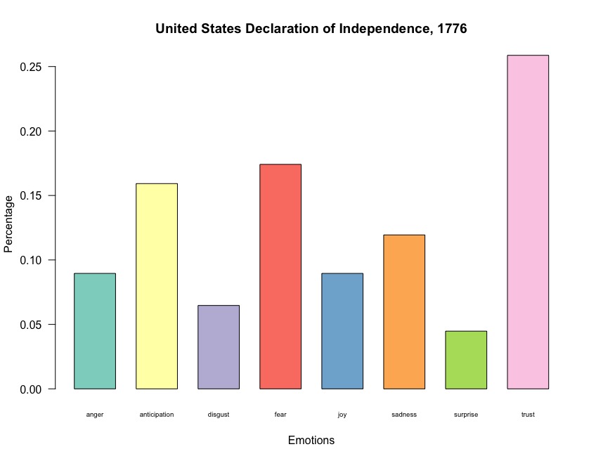
    Interestingly, the US Declaration contains more positive sentiment than negative, as well as a high Trust emotion average. The next highest emotional averages are Fear and Anticipation.

    We see below that over a quarter of the words used in the US Declaration of Independence fall into the Trust emotional category, followed by Fear, Anticipation, and Sadness.

    Like the Irish Declaration, Trust is the overwhelming emotion throughout the US document. Fear and Anticipation are also present throughout the text, as is Sadness, which is not present in the Irish declaration. The text categorized as Sadness links to phrases lamenting the refusal of the British monarchy to “assent to laws” and the despotic nature of King George’s rule of the colonies. This indicates the reluctant nature with which the Declaration was written, as the colonies now deemed it necessary to “dissolve the political bands which have connected” America with Britain.

    The Declaration of the Rights of Man and of the Citizen, France 1789

    Heavily influenced by the US Declaration of Independence, revolutionary France’s Declaration of the Rights of Man and of the Citizen was ratified by a soon-to-abdicate (and soon-to-be-executed) Louis XVI on October 5, 1789. The declaration’s power has resonated throughout French politics since then, with the current Fifth Republic’s constitution citing the declaration in its preamble and earlier French constitutions using the declaration as their foundation.

    Much like the US declaration, the Rights of Man and of the Citizen lay out certain inalienable rights through its 17 articles, most notably is citizens’ right to resistance of oppression. While the US Declaration comes across mostly as an airing of grievances, the Declaration of the Rights of Man and of the Citizen lays out specifically what French citizens can expect of the new government. Citizens of the new French government can expect that they are presumed innocent unless otherwise proven guilty; citizens can freely express their ideas and opinions (unless the idea is “tantamount to the abuse of this liberty”, and which the abuse is determined by “Law”. Reading this, I’m struck by the expressions of freedom counter-balanced against expressions of the forcefulness of the “Law”). The declaration also ratifies the separation of governmental powers and and declares the “right to Property” as inviolable and sacred.

    The declaration reads more like a proto-Constitution than a declaration of France’s freedom from tyrannical monarchy. While the different articles lay out the rights Frenchmen could expect under the new government, the declaration doesn’t specifically lay out the reasons why there is a break with the monarchy. The only part of the document that may point to reasons why the monarchy is being abolished come in the first lines, when the “representatives of the French People” say that “ignorance, forgetfulness or contempt of the rights of man” are the causes of “corruption of Governments”. Clearly, the monarchy was forgetful of its essential duties in guaranteeing rights to its French subjects.

    The Declaration of the Rights of Man and of the Citizen is a largely positive document, with words associated with Trust forming the highest proportion of text used throughout the document. Anticipation and Anger follow, and then Fear.

    A high proportion of words associated with Trust tracks with the two previous declarations I’ve looked at (Ireland & the US), as well as a decent percentage of anticipation-related and fear-related text. The French document has had the highest amount of Anger-related text of all the declarations I’ve looked at so far.

    The word cloud below clearly shows how words associated with Trust dominate the French declaration. Interestingly, the word “law” is one of the largest in the Trust sections of the cloud, indicating the emphasis the writers wanted to put on the ability of the law to maintain the rights of French citizens. Words associated with Fear make up a large chunk of the document, as well, and appear to deal with offenses against the freedoms of French people.

    Declaration of the Independence of the Mexican Empire, 1821

    Using the syuzhet package to analyze Mexico’s Declaration of Independence will provide an interesting look at how sentiment analysis can handle different languages. I suppose I could have used a French dictionary for The Declaration of the Rights of Man and of the Citizen, but I know Spanish much better than French. I’m especially interested in any differences in sentiment and emotion between the English and Spanish versions of the declaration.

    The first screenshot below is a summary of the English translation of Mexico’s declaration. Like the previous declarations I’ve looked at, Mexico’s declaration contains more positive language on average than negative. There’s also more language associated with Joy (0.047) and Trust (0.063), which has the highest average so far of the 3 declarations previously analyzed. The original Spanish text of the declaration follows the same trend as its English translation, though the individual averages for the different emotions and positive/negative sentiment are slightly different.

    The emotional bar plots of Mexico’s declaration in English and Spanish reveal similar differences as the summary scores showed above. In the original Spanish text, words associated with Joy make up more than a quarter of the declaration, followed by Trust, Anticipation and Surprise. The English translation has the same top 4 emotions, but words associated with Trust are much higher than in the original Spanish. So far, all of the declarations I’ve analyzed contain more than a quarter of Trust words, but the Mexican declaration has been the only one without a high percentage of more negative emotions – Anger, Disgust, Fear, and Sadness.

    India’s Declaration of Purna Swaraj, 1930

    Next, I’ll look at India’s Purna Swaraj, a resolution passed in 1930 because of widespread dissatisfaction with Britain’s offer for India to become a Dominion of the Empire. The Purna Swaraj was passed a full 17 years before the sub-continent was divided, rather disastrously, into the countries we now know as India and Pakistan. The writing of the Purna Swaraj is credited to either Mohatma Ghandi or Jawaharlal Neru.

    The Purna Swaraj addresses a 4-fold disaster created by the British – economically, politically, culturally and spiritually. The British government wrung enormous profits out of India at the expense of the Indian people (highly recommend William Dalyrmple’s book ‘The Anarchy‘, covering the corporate take over of India by the East India Company before the EIC is subsumed by the British government). No real political power is given to the Indian people and the “free expression of opinion and free association” is denied by British rulers. Culturally, the education system imposed by the British has resulted in the Indian people hugging “the very chains” that bid them. Interestingly, the Purna Swaraj address the spiritual disaster inflicted on India in militaristic terms, complaining that “compulsory disarmament” has made the people unmanly and unable to defend themselves against foreign aggression.

    The Purna Swaraj is the first declaration I’ve looked at that has a higher negative average than positive. On average, there are still more words associated with Trust in the text, but Fear, Anger, and Sadness are the next highest averages.

    The bar plot shows that more than a fifth of the Purna Swaraj is associated with the Trust emotion. Fear, Anger, and Sadness make up the majority of the emotions in the text, however. This is the first declaration so far where the three primary emotions, after Trust, are all negatively associated.

    It’s interesting to see, once again, that “government” is associated with Fear. The words associated with Sadness are all associated with the treatment of India by the British Empire. What’s important to note, however, is that some of the words associated with Trust are out of context, in a way. For example, “hug” and “mooring” are associated with Trust. However, in the Purna Swaraj itself, the term “hug” is used to describe how Indians cling to the chains that bind them and that British cultural domination has ripped Indians from their traditions. This is an important example of not taking NLP-algorithms at 100% face-value.

    Congolese Independence Speech, 1960

    This speech, given by Patrice Lumumba on June 30th, 1960, marked the independence of modern-day Democratic Republic of the Congo from Belgian rule. Congolese independence had originally been mentioned by the Belgian king as the end of Belgium’s “civilizing” mission in Africa and Lumumba’s speech was a direct response to this interpretation of Belgium’s activities in the Congo. Lumumba’s speech was unscheduled and was widely criticized by the international community as “ungrateful” at a time when Belgium was granting the Congo independence. He was later murdered by Belgian contractors working with a military junta who launched a coup against Lumumba’s new government.

    His speech is absolutely worth reading in full. It is a powerful anti-colonialist statement, one that I feel should be taught in schools and should be more well-known that it is.

    Despite railing against the evils of colonialism, the sentiment analysis algorithm reads this speech as overwhelmingly positive. Words associated with Trust are represented in large amounts in the speech, much like the other declarations I’ve looked at. Joy, Fear, and Anticipation are also present in Lumumba’s speech. In fact, the sentiment scores for these emotions are on average higher across the board than many of the other declarations. This is likely because this isn’t a specific “Declaration of Independence” and more of a speech commemorating the Congo finally removing the yoke of Belgian colonialism.

    Nearly a quarter of Lumumba’s speech contains words associated with syuzhet’s Trust emotion, followed next by Joy, Fear, and Anticipation. Words associated with Sadness and Anger are also present throughout his speech. It’s clear that his speech was designed to elicit strong emotions from the Congolese people and the international community, which it in fact did. His Congolese audience loved the speech while the people around the world widely condemned his rhetoric, as noted above.

    Below is the word cloud from Lumumba’s speech. “Independence” and “liberation” are prominent in Anticipation’s word cloud section, and so is “grandchildren”, an optimistic nod from Lumumba to the Congo’s future. Within the Fear section, there’s language associated with slavery – “bondage”, “inhuman”, “domination”, and “cruel”.

    Sentiment Analysis Wrap-Up

    This has been an interesting foray into my first attempts at using sentiment analysis in R. Being able to compare different emotions running through independence declarations using the syuzhet package showed that similar emotions are present in all of the texts, especially words associated with Trust. Additionally, elements of Fear, Anger, and Anticipation are present, indicating a hhopefulness for liberation and fury at colonial overlords. That said, it’s important to read the documents and try to understand the context in which they were written. An algorithm like the one used by syuzhet essentially operates in a vacuum and can potentially take words out of context and assign incorrect emotional sentiments.

    In the future, I plan to explore sentiment analysis with some Python libraries and maybe try syuzhet again but use it on various novels and other longer texts.

  • Navigating San Antonio without a car remains a significant challenge. City streets are not particularly safe for cyclists or pedestrians, and the lack of a connected sidewalk and bike network hinders those who wish to engage in active transportation. However, recent statistics provide a glimmer of hope for those who prefer walking and biking.

    In the first four months of 2024, 15 pedestrians have been struck and killed by cars. While this number is tragically high, it is the lowest total for this period since 2020, when 20 pedestrians lost their lives. On the downside, pedestrian injuries have reached a five-year peak this year. This increase might suggest that improvements to the sidewalk network are encouraging more people to walk. Unfortunately, it also means more interactions with cars, which continue to dominate San Antonio’s streets.

    For bicyclists, 2024 has been particularly hazardous. Although only one cyclist has been killed so far this year, injuries have spiked, with 88 reported in the first four months. This figure continues a worrying upward trend in bicyclist injuries in the city. San Antonio’s extensive trail system along its rivers and creeks is ideal for recreational cycling, but accessing these trails often requires navigating heavy traffic and multiple intersections. The cyclist who was killed earlier this year was leaving one of these creek trails.

    These statistics highlight a broader mobility issue for both pedestrians and cyclists in San Antonio. The city is making efforts to improve walkability and bikeability, with initiatives such as the new Bike Network Plan and the revamped Vision Zero program. While these plans will take years to implement fully, they represent a step in the right direction. San Antonio residents deserve safer, more accessible options for getting around without relying on cars.

  • On February 14, 2024, William Mize was struck and killed by a driver as he was exiting the Acequia Creek trail on his bicycle. He was 65 years old. His was the first bicyclist death of 2024. The details of the crash are sparse, but it highlights the dangers of entering and exiting the great creek trails that San Antonio has created for safer recreation. If one cannot safely take advantage of the trails and is at risk of becoming a casualty just trying to get some exercise, the whole purpose of these routes is defeated.

    Unfortunately, the start of 2024 has been more dangerous for pedestrians and cyclists than the beginning of 2023 in almost every category. Overall incidents are up from 189 to 214 and serious injuries are up from 22 to 35. The lone categories in which 2024 has been better for those who want to use alternative transportation are “Fatal Injuries” and “Not Injured”. At this point last year 10 pedestrians had been killed, compared to only 6 so far in 2024. No bicyclists were killed in the first 2 months of 2023.

    It’s still early in 2024, so there’s time for San Antonio to reverse these trends. Work continues on the new Bike Network Plan and ActivateSA has been making a strong push for the city to adopt an updated Complete Streets Policy for the city. Take the surveys and let San Antonio that our streets don’t need to be dominated by cars!

  • One of my favorite weekly emails comes from Data Is Plural. Each Wednesday, DIP sends out a list of several datasets of interest, either submitted by different people or found from a range of different sources (academic journals, personal GitHub repos, etc). It’s incredibly fun going through the new datasets and seeing what types of data people are collecting.

    One of the datasets that caught my eye as I was going through DIP’s archive was one titled “Legislative Limits on Teaching”, from August 24, 2022. PEN America published a report calling state bills that seek to restrict the teaching of certain subjects “educational gag orders” (EGOs). The report looks at various legislative attempts at the state level to restrict the teaching of certain subjects, many dealing with race, gender, ethnicity, and sexual orientation. When I accessed the dataset (February 12, 2024), there had been 307 bills filed since 2021 that PEN classified as an educational gag order.

    What struck me about the dataset compiled by PEN America was that 45 states had bills introduced to restrict teaching certain concepts and topics, including states that I did not think would be on there, like Illinois. Maybe it’s because I currently live in Texas, and since I’m from Illinois I have major bias, but I always thought that very red states would be the most likely to introduce these types of bills. Of course, I’m forgetting that outside of Chicago, Illinois is fairly conservative and even states with Democratic governors have legislative bodies that contain elected Republicans who are allowed to introduce bills all they want.

    I decided to map the data PEN America put together and also create a data table that provides the general summary of the bill when that row of the table is clicked by the user. I also included some summary information of the status of different bills throughout the country, as well as what groups (K-12, Contractors, etc) the bills target.

    Of the 307 EGO bills introduced since 2021, 28 have been signed into law in 18 states. These EGO laws target contractors, higher education, K-12 schools, private institutions, state agencies & political subdivisions, and one “other” category. Laws have been signed in states like Texas, Arizona, Utah, Mississippi, and New Hampshire. Luckily, the majority of EGO bills introduced over the last 3 years are dead but there are still at least 13 bills that are pending in legislatures across the country.

    The map is available here. I have some ideas for updates that I think would help make this map and dashboard more informative and, of course, if anyone reading this has any ideas please don’t hesitate to reach out and let me know!

  • On Sunday evening, I checked TxDOT’s Crash Query Tool to see if all of January’s crashes to start 2024 had been uploaded to the system. A full month’s worth of crashes were present, so I grabbed the data and began the process of updating my crash map.

    Everything worked seamless as usual – I filtered the CSV file to only pedestrians and cyclists, added January 2024 data to my map, and ran the update to Google Cloud and made sure the map was up and running.

    Then, I started to check the data and perform a quick recap of what pedestrian and cyclist safety looked like in January. I immediately noticed some significant discrepancies between the data I pulled down from TxDOT and what my data looked like after cleaning and filtering it to put into the dashboard.

    To perform my checks, I had to CSV files open – one with the raw data from TxDOT and one file that had been filtered in my program. I added some filters to my raw TxDOT data so that only pedestrians and cyclists were present. My filtered file had already been filtered. Next, I created pivot tables in each file to compare the amount of “Injury Types” for pedestrians and cyclists. When I saw the discrepancy, a pit formed in my stomach.

    My raw TxDOT data had a total of 90 incidents involving pedestrians (70) and cyclists (20), while the filtered data I had originally included in my map dashboard only had 44. This meant that every injury type was being more under-counted than it already was! For example, the raw data in the image below shows that 5 pedestrians were killed in San Antonio during January. However, my filtered data I used to run the first update of the map only showed 1 pedestrian killed.

    I went back and looked at my filtering function used to isolate pedestrian and cyclist involved crashes from the thousands of rows in the raw data that included car crashes. Sure enough, I spotted my error: I was removing rows that didn’t have a value for every single column! In the image below, you can see that line 58 is commented out, which means that it doesn’t have any effect on the function now. But that line was removing rows that should have stayed in the data. It also meant that every single time I’ve used the function over the past year, valid data was being removed!

    I haven’t gone back to previous years to see how much data was being under-counted and what the difference was, but now I know for sure that important data was missing from previous updates. I’m disappointed that I’m only realizing this now and will most assuredly perform a more robust review and quality check of my data for running any updates to the dashboard.

    The crash map and dashboard that’s currently available is now up-to-date and fully accurate. If anybody recognizes any more discrepancies, please let me know so I can correct them as soon as possible.

  • The first weekend of the Allianz Football League is in the books and it’s time to see how my predictions did. Here they are:

    Kerry (2-8) v Derry (0-15) – My Elo model had this game as a toss-up, as Kerry came in with an Elo of 1635 while Derry entered with a 1633. Each squad had a 50% chance of victory in this match but Derry ended up the victor by 1 point. Kerry lost 7 Elo points and Derry gained 7, putting Kerry at 1628 and Derry at 1640 heading into Round 2.

    Dublin (1-14) v Monaghan (3-9) – Dublin entered this campaign as the big dog with an Elo of 1687, while Monaghan came into this match sitting at 1512. Because of this wide Elo difference, Dublin entered with a 73% of victory but Monaghan came out victorious in an upset. Monaghan’s new Elo heading into Round 2 is 1522 while Dublin drops to 1678.

    Meath (0-12) v Fermanagh (1-9) – This match ended tied though Meath were the favorites, with a 57% chance of victory. The tie means their Elo ratings remain the same going into next week, with Meath sitting at 1534 and Fermanagh at 1485.

    Kildare (0-12) v Cavan (0-16) – Cavan entered this match with a 58% chance of victory and came out on top, bumping their Elo rating up from 1572 to 1585. Kildare, meanwhile, drops down to 1500, putting them right at the average mark.

    Armagh (0-12) v Louth (0-11) – Armagh was favored by my Elo model and came out on top by a point. They gained 6 Elo points, putting them at 1562, while Louth dropped to 1495.

    Laois (1-12) v Longford (2-7) – Despite one more goal than their opponent, Longford came out the losers in this match. Laois were favored 59%-41% and saw their Elo rise 9 points, up to 1489. Longford now sits at 1411.

    Tipperary (1-14) v Carlow (3-10) – One of the closer matches based on Elo, Carlow came out on top, seeing a 10 point Elo bump with the victory and now sit at 1430. Tipperary now sits below the 1400 mark at 1397.

    Galway (0-10) v Mayo (2-12) – Mayo comes away with a solid win by 8 points, despite being a 10% underdog against Galway. Mayo also receives a pretty massive boost in their Elo rating, jumping from 1581 to 1604. Galway drops from 1613 to 1589.

    Tyrone (0-17) v Roscommon (1-11) – Another underdog victory in this match. Tyrone came into this fixture with a 46% chance of victory but pulls out the win without scoring a goal. They gain 15 points in their Elo rating and now sit at 1547, while Roscommon falls to 1543.

    Donegal (1-20) v Cork (2-6) – Donegal seemingly couldn’t miss, scoring a massive victory over Cork despite only having a 41% chance of victory. Cork’s new Elo sits at 1505 while Donegal jumps to 1496.

    Limerick (2-7) v Antrim (2-14) – Antrim entered this match with a 60% win probability and came out on top by 7 points. With the win, Antrim joins the 1500 Elo Club and has a new rating of 1512, while Limerick drops to 1409.

    Wicklow (0-13) v Down (0-18) – Down comes away the victor in this match and sees their Elo jump from 1537 to 1551. Wicklow drops from 1461 to 1448.

    Offaly (0-10) v Westmeath (1-11) – Westmeath wins this one by 4 points overall, having had a 59% chance of victory heading into the fixture. Offaly’s Elo rating now sits at 1464, down from 1477, while Westmeath jumps from 1538 to 1551.

    Clare (0-9) v Sligo (1-5) – A low-scoring affair, as neither team cracks double digits. Clare comes out on top by a point despite being the underdog and gets an 8 point rating boost to 1471 while Sligo dips to 1510.

    London (1-9) v Wexford (1-13) – Wexford came in as the favorites in this match and didn’t disappoint, carrying the day. London’s new rating now sits at 1366 and Wexford jumps to 1474.

    Waterford (1-5) v Leitrim (2-17) – An absolute pasting by Leitrim as they easily handle the lowest rated squad. Leitrim gains almost 20 Elo points and now head into Week 2 at 1478 while Waterford are at 1331.

    Elo Model Performance Week 1 (Correct-Wrong-Tie): 9-6-1

    My Elo predictions were off in 5 games. I had Dublin, Meath, Galway, Roscommon, Cork, and Sligo all favored in their fixtures in Week 1, and they all lost. The “tie” comes from the Kerry v Derry match, which had both teams at a 50% chance of a victory. In the future I may try to figure out a way to avoid coin-flip predictions like that.

    Here are the updated rankings heading into Week 2, along with each team’s Elo differential:

    Team Week 1 Starting Elo Week 1 Ending Elo Elo +/-
    Dublin 1688 1678 -9
    Derry 1633 1640 +7
    Kerry 1635 1628 -7
    Mayo 1581 1605 +24
    Galway 1613 1590 -24
    Cavan 1572 1585 +13
    Armagh 1557 1563 +6
    Westmeath 1539 1552 +13
    Down 1538 1551 +14
    Tyrone 1532 1547 +15
    Roscommon 1558 1543 -15
    Meath 1535 1535 0
    Monaghan 1513 1522 +9
    Antrim 1496 1512 +16
    Sligo 1518 1511 -8
    Cork 1534 1506 -29
    Kildare 1514 1501 -13
    Donegal 1468 1497 +29
    Louth 1501 1495 -6
    Laois 1481 1489 +9
    Fermanagh 1485 1485 0
    Leitrim 1460 1478 +18
    Wexford 1463 1474 +11
    Clare 1463 1471 +8
    Offaly 1477 1464 -13
    Wicklow 1462 1448 -14
    Carlow 1420 1431 +11
    Longford 1420 1411 -9
    Limerick 1425 1409 -16
    Tipperary 1408 1397 -11
    London 1366 1355 -11
    Waterford 1350 1332 -18
  • With the onset of the Allianz Football League, I’m back to rating & modeling the Senior County Football teams for this 2024 season. This year, I’d like to continue my ratings and predictions all the way through the All-Ireland championship, time and other commitments permitting.

    I previously wrote about my methodology for developing my ratings here, but last week I went ahead and revamped them for the upcoming season. The ratings are still a bit crude, but I think they’re a decent reflection of the quality of the county teams heading into the 2024 season. I used 538’s methodologies for developing their NFL Elo Ratings and Soccer Power Index as guides throughout my process. These are super interesting reads and provide a lot of context into how much goes into developing their ratings. I’d love to get to the point where I’m incorporating a lot of similar data points for these ratings in the future. If anyone wants to help make these ratings more robust and encompassing, reach out and I’d love to hear your ideas.

    Ok, let’s get into how these ratings work.

    The Data

    I collected all match results from the main GAA Fixtures & Results page (sidebar: It looks like the Fixtures & Results page is either broken or the website is acting up as of this writing, which is frustrating). When I started collecting the match data, the earliest available matches dated back to the beginning of 2016. The match results are now up-to-date from 2016-2023 and the data is available here.

    The match results are pretty basic – it includes the Date, competition, Team 1, Team 2, the points, goals, and total score for each team.

    Calculating the Ratings

    To start the ratings, I initialized every team’s rating at the start of 2016 to 1500, which represents an average rating. The rating will be used to calculate the expected score and win probability of the match. This means that the win probability for each team at the start of the 2016 season is 50%, as they all have the same Elo rating.

    In a slight change from my previous rating attempts, I decided to add a Margin of Victory (MoV) multiplier into the model. Because there are potential ties in games of Gaelic Football, this MoV multiplier gives teams credit for how they win – do they dominate or barely beat their opponent. The MoV multiplier takes the natural logarithm of the point differential and adds one point. Ideally, this will help with auto-correlation problems, which sometimes means that blowout wins by good teams could see their ratings swell disproportionately to the quality of the opponent.

    Another factor of the Elo model is the k-factor. The k-factor tells the model how quickly to react to recent events. A high k-factor tends to over-emphasize recent results while a lower one may not accurately reflect the strengths and wins of a team. For now, I settled on a k-factor of 20, which is large enough to properly rate teams but not so high that ratings fluctuate too much from week to week. This means that the most Elo points any team can gain or lose from one game is 20.

    Next, I defined a function to calculate the amount of Elo points the teams will gain or lose depending on the outcome. There are several factors that the function takes into account – the difference in Elo rating between the 2 teams; the MoV; the expected score/outcome. I then looped through the entire data set using the function to determine new ratings for each team after every match.

    To try and account for player turnover from season to season, I rotated each team’s starting Elo rating for the next season a third of the way back to 1505 from their ending rating of the previous season. Because I currently don’t account for new players coming into the squad and players leaving, or a new coach coming in, this is an attempt to adjust for all the offseason moves that may happen. For example, Dublin ended the 2024 season as All-Ireland champions and had an Elo rating of 1770 to end the campaign. Heading into the 2024 campaign, Dublin starts with an Elo rating of 1688, which is still tops among all the county teams.

    After the loop finishes working its way through the data, the result is that for every Senior County Football match from 2016 onwards we have the starting and ending Elo rating for every club. That rating gets carried over to their next match and is used to predict that outcome and so on and so forth.

    To use a visual example, let’s look at the journeys Dublin’s and Kerry’s Elo rating took throughout the 2023 season. These teams played each other in the All-Ireland Final in July 2023, but one can argue that Kerry played against tougher competition during the run-up to the All-Ireland, as Dublin was in the second division of the AFL, whereas Kerry was in the top division. Dublin started the 2023 campaign with an Elo of 1619, while Kerry began the season rated at 1673. Dublin tore through the 2023 season, while Kerry had a rougher go of it. You can see that in the chart below, which shows Kerry’s and Dublin’s Elo rating after each match.

    Kerry’s flatter Elo rating throughout the course of 2023 indicates the better competition they faced, though they still increased their Elo rating nearly 30 points overall. Dublin, however, increased their overall Elo rating dramatically, winning nearly every game and often winning by a fairly sizable margin. Going in the championship match for the All-Ireland, Dublin had a 1770 rating and Kerry was at 1708, with the Elo model giving Dublin a 59% chance of coming out with a victory. Dublin did end up winning the All-Ireland, ending the 2023 season with an Elo of 1779. Kerry ended the 2023 season with a rating of 1700.

    The 2024 campaign kicks off today, and I’ll be working on a season-long simulation to try and project out towards the summer how the clubs will finish. Stay tuned!

  • 2023 has come to an end and I’d like to extend everyone best wishes for the coming year! I hope your 2024 is full of happiness, fulfillment and safety for yourself and your loved ones if you decide to walk or bike here in San Antonio.

    The conclusion of 2023 also means that it’s been about 1 year since I’ve started collecting crash data for U.S. cities within the Vision Zero Network. The crash data I collected is all available on my GitHub page, but I only continued collecting crash data through 2023 for San Antonio, the city in which I live.

    Beginning in April 2023, I published the first iteration of the San Antonio Vision Zero Crash Map and have continued to update the web application every month with new data. I also did a fairly big overhaul of the map to its current form and I plan to continue adding features and charts/graphs as 2024 rolls on. If you have any feedback or comments on the dashboard, there’s an opportunity for you to send me an email!

    The ending of an old year and the beginning of a new year is a perfect time for reflection. To that end, I wanted to do a 2023 Year-In-Review of sorts from a pedestrian & bike-safety lens for San Antonio. I’ll start with some basic aggregate data from 2023 and compare that with previous years’ data before moving into some more detailed analysis.

    **An important thing to keep in mind as you read through this Year-In-Review is that all of these numbers are likely undercounted due to reporting discrepancies between SAPD and TxDOT. The city’s transportation department is still trying to ascertain why these discrepancies exist.**

    2023 Aggregate Data – Pedestrians & Cyclists

    630 total people walking or riding a bike in San Antonio were involved in some sort of crash that involved a motor vehicle in 2023. 70% (444) of these crashes involved pedestrians and 30% (186) involved bicyclists.

    Below is a breakdown of injuries and average age for pedestrians and bicyclists in 2023. The percentages are based on total injuries (i.e. 1.6% of “Unknown” injuries for pedestrians is 1.6% of ALL injuries for pedestrians and bicyclists combined). The total average age of all bicyclists injured or killed in 2023 is 37 and for pedestrians its 41. The youngest bicyclist involved in a crash this year was 3 years old and the youngest bicyclist suffering a serious injury was 23. For pedestrians, it’s even worse. A 1-year old child, classified as a pedestrian in the police report, was killed this year. The youngest pedestrians injured by cars this year range from 1 to 7 years old. Young people are getting hurt and dying on San Antonio’s car-centric streets.

    Injury TypePedestrianPedestrian Avg AgeBicyclistsBicyclists Avg Age
    Unknown10 (1.6%)336 (1%)65
    Suspected Serious Injury55 (8.7%)3415 (2.4%)41
    Suspected Minor Injury225 (35.7%)39114 (18.1%)37
    Possible Injury79 (12.5%)4228 (4.4%)33
    Fatal Injury26 (4.1%)463 (0.5%)57
    Not Injured49 (7.8%)4020 (3.2%)32

    Hispanics & Latinx account for 55% of all people (pedestrians & bicyclists) involved in some sort of crash. White people make up 30%, followed by Black people at 10% and “Unknown”, American Indian/Indigenous and Asian making up the remaining 5%. The Hispanic/Latinx demographic group also make up more than 50% of all injuries when looking at pedestrian and bicyclist crashes separately. The same is true for fatal injuries in 2023 – Hispanics/Latinx make up 55% of all pedestrian and bicyclist fatalities in San Antonio.

    The chart below shows injury types for pedestrians and cyclists in San Antonio during 2023. There was at least 1 pedestrian fatality every month this year, and many more pedestrians were injured in some way throughout the year. Cyclist injuries peaked in March 2023 but showed a general decline throughout the rest of the year. Overall, there were less cyclist injuries than pedestrian injuries in San Antonio.

    Fatal injuries for both pedestrians and bicyclists have remained fairly constant over the last 10 years. Minor injuries account for most of the interactions between pedestrians, bicyclists and cars, with an upward trend in minor injuries since 2020. Encounters resulting in “Possible” injuries have been decreasing for pedestrians and bicyclists, but all other injury severity categories remain relatively constant over the past decade.

    Crashes & City Council Districts

    I’ve looked at crashes within San Antonio’s City Council Districts before, but that analysis only went through 2022. With 2023 complete, I can now review this year’s data and see what, if anything, actually changed.

    Districts 1 and 5 once again had the most aggregate crashes (pedestrian & bicyclist) in 2023. District 1 had 125 pedestrian/bicyclist involved crashes and District 5 was not far behind, with 122. They also had the highest amount of fatalities in the city – District 1 saw 6 fatal injuries (all pedestrians), 21% of San Antonio’s total deaths, while District 5 suffered 9 fatal injuries (2 bicyclist and 7 pedestrian), accounting for 31% of San Antonio’s total deaths. Together, these two districts made up over half of all pedestrian & bicyclist fatalities in San Antonio during 2023.

    In fact, Districts 1 & 5 have been the most dangerous districts for pedestrians and cyclists for the last decade. District 1 alone has accounted for over 20% of all injuries in San Antonio since 2013. District 5 has accounted for 17% since 2023. Both city council districts have the highest population density in San Antonio and the data make clear that safer pedestrian and cyclist infrastructure is much needed in these areas. Curb-cut sidewalks and unprotected bike routes along major streets with 30MPH speed limits are just dangerous problems, not solutions.

    I also wanted to examine the relationship between the median income of San Antonio’s poorest areas with pedestrian and cyclist crashes. The table below shows all crash types for pedestrians & bicyclists for San Antonio’s poorest Census tracts for 2013-2023. Almost every single tract has seen a pedestrian or cyclist killed within the last decade. The map below the table shows where these tracts are located in San Antonio, along with their household median income from the 2021 American Community Survey. Many of San Antonio’s poorest areas are clustered on the West Side, which also see significant amounts of pedestrian & bicyclist violence.

    The table and map below show the 10 census tracts in San Antonio that have the highest total amount of all types of crashes over the last decade. Interestingly, the two census tracts with the highest median income also have the most amount of crashes. Both of these tracts are in or near the downtown core of San Antonio, where drivers are more likely to encounter pedestrians and bicyclists. The tracts near downtown are also quite close to freeway exits and entrances, which together with their frontage roads, provide a speedway for cars traveling through the city.

    Summary, Conclusion, 2024 Outlook

    I realize that the latter part of this post kind of became a decade-long look at pedestrian & bicyclist crashes in San Antonio, specifically around City Council Districts, rather than only a 2023 review. Looking at crash data for the last decade, I think it’s unfortunate to say that San Antonio’s safety record for pedestrians and cyclists has remained relatively stagnant. There’s been some dips in fatalities and serious injuries during some years, but they have typically risen again, especially in the post-pandemic years. There’s been no steady decrease in any crash-severity category.

    Some things I’m going to keep an eye on this year: will Districts 1 & 5 continue to have the most injuries for both pedestrians & bicyclists? Will bicycling related injuries rise given the city’s emphasis on creating a new Bike Network Plan and engaging the community? How many pedestrians are going to be injured on frontage roads and/or close to freeway exits and entrances?d

    I hope in 2024 that things start to turn around. The city is currently updating their long defunct Bike Network Plan, with a focus on commuters. The trails San Antonio has created along its creeks and rivers are great for recreational cycling, but in a city where a car is almost a necessity for quick trips more multi-modal options are required. There’s also been more funding for bike lanes across downtown, though construction won’t until 2026 at the earliest.

    Overall, it seems like San Antonio leadership is finally taking seriously the need for better bicycle infrastructure to keep riders safe. While it may take several years for this focus on infrastructure to be seen on San Antonio’s streets, the future for bicycling safety is looking up.

    My worry is that the focus on bicycling safety is overshadowing pedestrian safety and creating a better pedestrian network. Sidewalks end randomly without any easy access to get to the other side and some streets don’t have sidewalks at all. Hopefully the city’s Transportation Department can also focus on improving pedestrian safety to create a city that is supportive of alternative transportation modes.

  • Happy December, everyone! Christmas has come early for those of you interested in pedestrian & cyclist safety in San Antonio. Unfortunately, many car drivers will still be getting lumps of coal from Santa this year.

    I’ve made some pretty significant updates to my Pedestrian & Cyclist Crash map. The updates are mostly related to the lay-out and some additional information I’ve added, which I’ll walk through below. I’ve removed some features, but I plan to add in more features over the coming months, as well.

    First off, the layout of the dashboard has changed quite a bit. I’ve added a new menu sidebar with a couple different options for you to choose from. The home page of the dashboard is now a description of the project – a little background on San Antonio’s Vision Zero plan, where I think it falls short, why I decided to create my own dashboard, a description of the different maps, and where I got the data from.

    Below the home page on the sidebar menu is where you can pick which maps you want to view. The first map option is the crash map with San Antonio’s City Council districts included. This map shows both pedestrians (green circles) and cyclists (blue cyclists). Clicking on a circle will bring up information on the crash like injury severity and date. You can still filter the crashes on this map by “Injury Severity”, “Person Type”, and by Year. For now, I’ve removed the option to select which council districts appear on the map. Once I make some adjustments to my data and link the council districts to each crash’s location I plan to add that feature back into the dashboard.

    The second map option shows San Antonio’s bike routes and all crashes involving cyclists. Previously, this map showed pedestrian-involved crashes, as well, but since a main feature of the map are the bike lanes I decided to only include cyclist-involved crashes. You can still filter by “Injury Severity” and Year in this map.

    Another feature that I’ve removed for the time being are the demographic tables. I do plan to add those back as a new tab in the next couple of months, but I wasn’t too happy with their presentation in the dashboard. Once I fix the layout and some of the data values, I’ll add those tables back in since I think they provide valuable context and information.

    The next sections provide some deeper background on the data and program I use to create the dashboard. The “Data Description” section details where I obtain the crash data, San Antonio’s city council boundaries, and the bike routes currently present in San Antonio. The “Technical Notes” section provides some more detail about how I build and maintain the dashboard using R. I’m working on a longer and more detailed write-up of my code and script which I’ll post in the future.

    And finally, the “About Me” section has a little more detail about…me!

    The last two sections are very new. I currently host my dashboard on Google Cloud, which isn’t free. If the spirit moves you, I’ve set up a “Buy Me a Pizza” account in case you’d like to donate and help offset some server costs. I’m using the site “Buy Me a Coffee”, but since they have a pizza option and I consider myself a pizza aficionado, I chose that option.

    The last section gives an opportunity for you, the user, to provide feedback on the dashboard. If you see an issue, an error, or want something added to the dashboard, fill out the survey and I’ll get an email with your comment!

    As I mentioned above, the data used in the dashboard will continue to be updated monthly and I’ll likely add new features to the dashboard periodically between data updates.

    As always, if anyone has any comments, suggestions, or would like to work on the project, get in tough!