I’m waiting for July to end so I can do my monthly data pull from Texas’ CRIS site and I’ve been thinking a lot about a recent report from the Governors Highway Safety Association that stated that the number of pedestrians killed by vehicles has reached a 40-year high. In 2022, 7,508 people out for a stroll were struck and killed by vehicles in America. That’s 20 people killed per day.
In San Antonio, 72 pedestrians were killed by drivers in 2022, with another 630 experiencing some sort of injury. All told, 1,154 pedestrians were involved in some sort of vehicular crash, coming out to 3 pedestrians a day having their lives disrupted some sort of vehicular incident.
3 pedestrians a day being struck or having a close call with a vehicle doesn’t sound like a lot on the face of things. As discussed before, San Antonio is a car-centric city, where owning car is essentially a necessity for getting around. Cars are all over the city and consistently choke the freeways which bisect San Antonio with congestion and pollution.
However, San Antonio has committed to Vision Zero and published their Action Plan in 2016. Unfortunately, the Action Plan does not have a target date for eliminating pedestrian and cyclist fatalities on city streets. This toothless document gives city officials something to point to as evidence that they’re taking the issue seriously, but is really filed away along with numerous other “Plans” that the city produces but then forgets. Pedestrian and cyclist fatalities and serious injuries haven’t decreased in any appreciable manner since the Action Plan was adopted, despite a handful of Vision Zero safety projects completed by the City.
I decided to look at some of the contributing factors noted by police in their CR-3 crash reports for 2022. Many crashes had multiple contributing factors noted in the CR-3 reports for each type of crash severity. One contributing factor that caught my eye was the one titled “Pedestrian failed to yield right of way to vehicle”, which was noted 20 times as the sole factor. Just looking at my spreadsheet it’s hard to get a clear picture of what happened to these unfortunate pedestrians and how they were in the wrong. Perhaps they were crossing in the middle of the street because there wasn’t a pedestrian crosswalk in a convenient spot for them.
The lowest speed limit indicated on the streets in which these types of crashes occurred is 30mph (5302 De Zavala Rd; screenshot below). The highest speed limit was 65mph and crashes occurred on IH-410 and US-90, both highways in San Antonio. The cars in the screenshot below are driving in an area engineered for cars to go as fast as possible – just another example of how our streets are dangerously engineered for maximum speed to the detriment of pedestrians.
This probably isn’t surprising, but other contributing factors that played a role in every type of crash severity in San Antonio was “Driver Inattention” and “Failure to Control Speed”. Of the 72 pedestrian deaths in 2022, 27 of them occurred on streets where the speed limit was 35mph or slower, nearly 38% of total deaths. It’s a clear indication that speed limit, especially in residential and neighborhood areas, need to be reduced drastically.
As of July 21, 2023, 27 pedestrians have been fatally injured walking in San Antonio, 55 have suffered serious injuries, and overall, 458 pedestrians have been in some sort of incident with a vehicle. This continues a dangerous trend for San Antonians who wish to get around the city in ways other than a car. If the City is serious about their Vision Zero plan, then much more strenuous and quick work needs to be done to make San Antonio much more inclusive for all modes of travel.
San Antonio is a car-centric and sprawling city, encircled by two major freeways – Loop 410 and Loop 1604. If you count the convergence of several other freeways in the downtown area, there’s actually three highway loops wrapped around the city. According to walkscore.com, San Antonio has a 37 walk rating, a 31 public transit rating, and a 45 bike rating, making San Antonio a mostly car-dependent city.
Loop 1604, Loop 410, and convergence of I-10/I-35 and other freeways downtown
Car-dependent cities all over the world are generally not very safe for pedestrians or bicyclists. When a city is designed so that people can get from Point A to Point B as rapidly as possible in a car, there’s going to be unsafe sidewalks and little to no protection for bicycles.
Since the end of 2022 and continuing through 2023, I’ve been collecting crash data for cities in the United States that have an officially recognized Vision Zero Action Plan from the Vision Zero Network. San Antonio is one of those cities with a Vision Zero Action Plan and, since I live here, I want to know more about what the city is doing to promote active transportation and reduce car-dependency. To that end, I created a dashboard with a map of pedestrian and cyclist crashes and some basic summary tables. You can view San Antonio’s official Vision Zero crash map here.
The summary tables in my dashboard provide some basic information regarding crash injury types and the demographics of people who are unfortunate enough to be involved in a crash. I want to go a little further here and incorporate some newer data on San Antonio’s City Council Districts and bike facilities from San Antonio’s Open Data portal.
Using the city’s City Council District shape file, I was able to determine which district each crash in my dataset occurred in. This gave me the aggregate number of pedestrian and cyclist crashes occurring in each district throughout San Antonio. Districts 1 & 5 have the highest aggregate amounts of pedestrian & cyclist involved crashes, followed by Districts 2 & 3.
Districts 1 & 5 lead the way again when it comes to crashes only involving pedestrians. District 1 saw significant increase in pedestrian crashes from 2014-2019 before the pandemic, while District 5 saw fairly steady numbers of pedestrian involved crashes until 2016, when the district saw a 52% increase in pedestrian crashes.
Districts 1 & 5 lead the way again in cyclist involved crashes, with crashes in District 1 doubling crashes in District 5 in 3 out of the last 10 years.
Aggregate pedestrian and bicyclist crashes in San Antonio did dip in 2020 with the COVID-19 pandemic in full force, dropping to the city’s lowest level in 2020. Unfortunately, pedestrian deaths have climbed the last three years across the country and some of San Antonio’s Council Districts have experienced that trend, as well.
I’m going to be doing a closer look at the population and density of each district, but on the surface, I’m not surprised Council District 1 has the most crashes involving both pedestrians and cyclists. District 1 encompasses San Antonio’s downtown, which is small, has fairly narrow streets, and a lot of vehicular traffic, especially on weekends. San Antonio’s downtown could be a walker’s paradise with some big tweaks (especially regarding parking and car travel) but that’s a subject for another post.
Orange and red lines indicate moderate to heavy traffic (Typical Saturday at 5:00 PM)
Using population and population density data from SA2020, I came up with each council district’s pedestrian/cyclist crashes per capita. Population densities vary widely throughout San Antonio. The districts were redrawn in 2022 because of new 2020 Census population numbers and the goal was to get as close as possible to 143,949 (San Antonio’s 2020 Census population divided by 10 districts). Prior to the redraw, Districts 1 & 5 had 20,000 fewer people than the ideal number but there’s now 141,216 and 141,149 people in those districts respectively.
I do plan to dive more into San Antonio’s population density based on the concept of walkable density in a future post, one in which gets more how a pedestrian experiences walkability in their own neighborhood. For now, I’m just using basic density calculations based on population size and the square mileage of each district.
Districts 5, 7 and 1 have the highest population density in San Antonio while districts 3 & 4 have the lowest. Before this, I didn’t realize that district 3 was more than twice the geographic area of district 1 despite having less people. San Antonio’s smallest district by population is district 4, with only 135,763 people despite being the second largest by geographic size.
Now that I have this population and density information, the crash data I have on cyclists and pedestrians takes on a different hue. Districts 1 & 5 don’t have as high of populations as other districts yet crashes involving cyclists and pedestrians make up 40% of city-wide crashes over the last decade. If we look at total pedestrian/cyclist crashes in each district, 1 & 5 also have the highest crash rate – 12 and 9 crashes per 1,000 people since 2013. Districts 2 & 3 are close behind, with 6 crashes per 1,000 people, but no other district in San Antonio is above 4 crashes per 1,000 people.
The densest council districts in San Antonio have the highest crash rates despite having fewer people within their boundaries as some of the other districts. My instinct is that denser areas of San Antonio should actually see fewer crashes involving pedestrians and cyclists but that’s clearly not the case. Each person who lives in San Antonio experiences walking differently, so comparing population densities in a district-to-district manner isn’t ideal.
Part of having a safe bicycle network is having actual areas where people can bike without the stress of worrying whether the driver in the Toyota Tundra with a 6-inch lift kit can see them before they make a turn. In my opinion, this should mean that there are bike lanes clearly separated from the car lane with a physical barrier, not simply a stripe of paint. Ideally, the physical barrier is some sort of sturdy bollard (Target has the best bollards in the US), a raised bike lane next to the sidewalk but clearly delineated from the pedestrian pathway, and at worst (but still better than paint), flexi-posts that at least provide a physical signal to drivers that they should avoid the area. Below are some decent examples from around the world.
Washington DC two-way bike lane on Pennsylvania AveA segregated two-way bike lane in ParisNYC DOT adds concrete barriers separating a bike lane
Luckily, San Antonio provides a dataset on all bike facilities throughout the city and in which district the facility is located. As of June 17, 2023, San Antonio has 3,069 active bike facilities, 85 inactive bike facilities, 5 buffered lanes pending completion, and 10 more buffered bike lanes that have been recommended by city staff. That’s only 15 new bike facilities planned through 2024, according to the data.
Below is a table showing San Antonio’s bike lane types and the total throughout the city. Districts 1, 5, and 6 have the most total bike facilities (448, 391, and 380 respectively) while Districts 4, 8, 9, and 10 have the least amount of facilities (216, 237, 205, and 215 respectively). Districts 1 & 5 have the highest bicyclist crash rate in the city, yet they also have the most bike facilities.
Bike Lane Type
Count
Bike Lane
1,880
Buffered Lane
152
Cycle Track
10
Multi-Use Path
139
Route
863
Separated Lane
15
Shoulder
10
Total
3,069
27% of all San Antonio active bike facilities are in Districts 1 & 5 but neither have any multi-use paths. District 5 has more bike lanes than District 1 but does not have any buffered lanes, cycle tracks, or separated lanes. In total, Districts 1 & 5 have nearly 58 miles of city bike facilities between them. Bike route miles make up 46% of total bike facility miles in District 1 and bike lanes are 72% of District 5’s bike facilities. If Districts 1 & 5 have the most city-recognized bicycle facilities and nowhere near the highest populations, why do they also have the highest bicyclist crash rates in the city?
Well, a possible answer could be that the bike facilities offered by San Antonio are inadequate. Below is a sample of some Google Maps screenshots of various bike facilities in Districts 1 & 5. Here we have multiple instances of cars being allowed to park in bike lanes, an unprotected striped bike lane on a street that allows for 30mph speed limits and includes a sign saying that bikes can use the full lane (no thanks), a bike “sharrow” underneath a freeway, an unprotected cycle track, and apparently bike routes all over San Pedro Park.
District 5District 5District 5District 5District 5District 1District 1District 1Cycle Track, District 1
Here’s what San Antonio calls a “buffered bike lane” on Josephine Tobin Drive to Cincinnati Avenue. I’m not sure why it’s called “buffered” as the only thing I can see being buffered here are parked cars. An actual buffered lane would probably see the cars and bike lane swapped so bicyclists are closer to the curb.
A “buffered” bike lane…gotta protect those cars!
What’s not pictured, and is most definitely an improvement on all of the above, is a new protected bike lane that runs down Buena Vista St in District 5! We need more of those! Unfortunately, as of writing, the protected bike lane that would run down Avenue B near the Pearl and the San Antonio Museum of Art is still not open, despite a supposed opening date around March 2023.
The above screenshots are just a very minuscule sample of all the bike facilities available in San Antonio. Some are better than others, but I’d venture to say that a small few are truly safe for cyclists.
San Antonio has made extensive improvements to the greenway creek trail system, however. I’ve ridden on the Alazan and San Pedro creek trails and while there are some definite improvements that could make the trails even better (more shade, benches, more trail access from streets/bridges), they are very enjoyable to walk and ride.
Many people might say: “But San Antonio is just not a biking city. Nobody bikes”. And while I disagree that nobody in San Antonio rides a bike, it’s hard to argue that San Antonio makes it incredibly easy for people to ride a bike safely and for accomplishing daily errands. San Antonio’s bike score rating from walkscore.com was mentioned at the top but People for Bikes, a bicycling advocacy group, gives San Antonio an even rougher score of 21 in their 2022 City Ratings. And in their updated 2023 city ratings, San Antonio now has a 13 city rating!
Bike commuting data from the Census Bureau doesn’t paint a great picture, either. San Antonians commuting by bicycle peaked at 0.26% of all commuters in 2014 according to ACS 5-Year survey data. Since then, bike commuting has held relatively steady around 0.2% of all commuters. The overwhelming majority of San Antonio residents commute alone in their private vehicle. I know that not everyone who rides a bike in San Antonio uses it to commute. I haven’t come across any decent data on recreational riding in San Antonio, but I may check out Strava’s developer tools in the future for this. I also haven’t been able to find ridership data for San Antonio’s bike-share BCycle, which I believe is privately owned and not a program of the city’s Transportation Department, like Divvy bikes in Chicago.
It’s encouraging that San Antonio’s Transportation Department is currently in the process of revamping the city’s 2011 Bike Master Plan. I’m not sure how much of the 2011 plan was actually implemented, but San Antonio does not have much of a bike network. It’s more like bits and pieces of mediocre and unsafe bike infrastructure dropped over the city for political leaders to point to and say that they are doing something for bicyclists. A proper bicycle network in San Antonio will make it cycling safe for people to accomplish daily tasks, like going to HEB or getting to work, or going to see friends and have dinner and drinks.
I didn’t get too much into demographic trends, crashes happening at intersections, types of vehicles involved in pedestrian/cyclist crashes, or year-over-year trends, which I’ll do in future posts about the data as it continues to get updated. I anticipate June’s crash data being available from CRIS sometime after July 4th, which is when I’ll update my dashboard and do some more analysis.
I know it’s really hot in San Antonio, right now. But, as much as you can, try to ride a bike the next time you decide to go out to eat. Or ride transit. Choosing to walk, bike, or take public transit may not be the most convenient personal decision, but it can help your neighbors, neighborhood, and other residents. Getting in your car for a 3-5 mile trip only contributes to pollution and traffic congestion, contributes to worse air quality and higher temperatures, and creates high stress from trying to navigate without drawing the ire of other drivers. Participating in active and public transportation can help reduce your impact on our city and make it healthier for everyone.
I recently purchased the book “Copenhagenize” by Mikael Colville-Anderson. I’m only about 30 pages into it but I was immediately struck by the really cool urban photography that’s featured in the book. So, naturally, I went to OfferUp and decided to find a relatively cheap starter camera.
I found a Nikon D3300 with 2 lenses, the charger and battery, and a case for a pretty good price, so I snatched it up. I have no illusions about becoming some amazing urban/street photographer or having my pictures displayed in some museum or gallery. I can barely take decent pictures on my iPhone. But the street photography in “Copenhagenize” was so striking to me that I felt inspired to try and take a swing at it.
San Antonio and Copenhagen are two extremely different cities (obviously). And the urban fabric of the Danish city lends itself to some pretty striking photos. But San Antonio has its own kind of charm and while I’ve been living here since October 2020, I’ve found that I tend to go to the same spots in the same neighborhoods most of the time. I guess urban photography is a way for me to venture outside of the same urban tracks I tend to follow.
Another way I plan to use my new camera is in support of some of the research that I do for these articles. Google Maps and Google Earth will definitely have their place in research, but they aren’t a real substitute for getting “on location” and snapping a few photos.
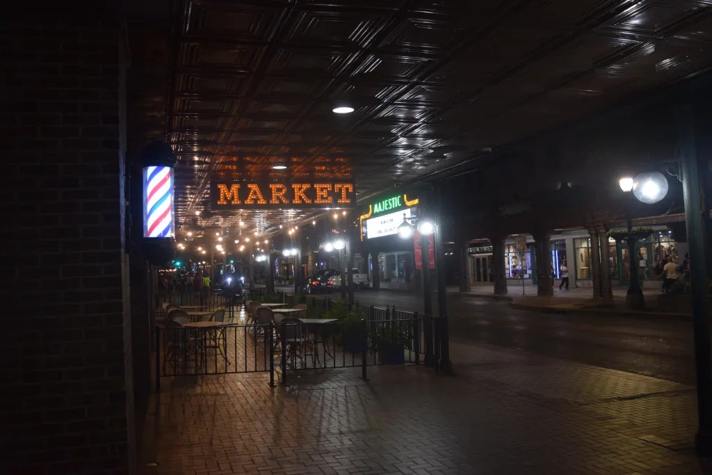
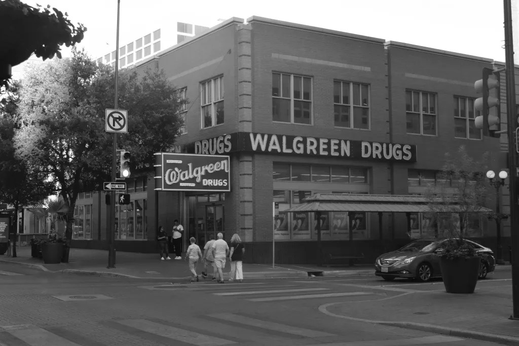
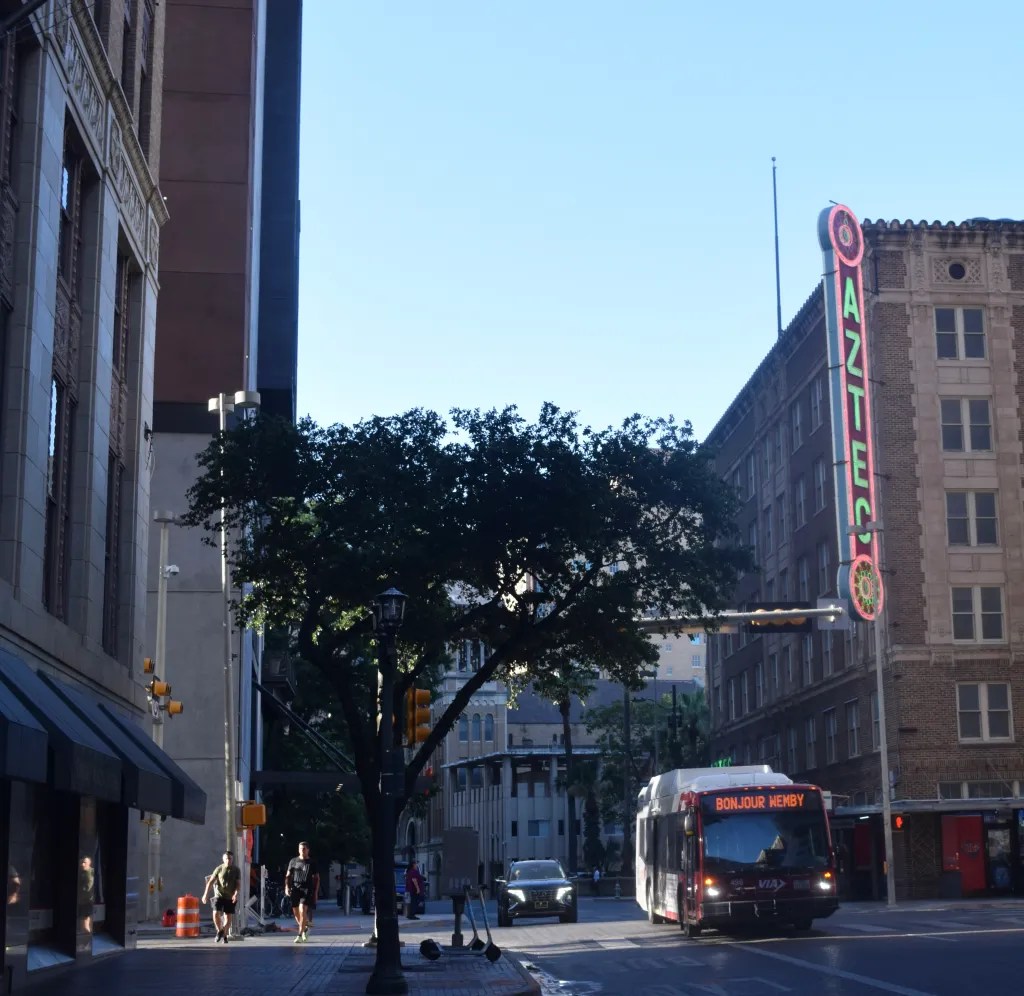
To that end, I’ve set up another menu page called “Photographs” where I’ll upload some of the better photos I take while I’m out with the camera. Some of will be decent, more will likely be mediocre, but I’m going to put them up there anyway and see how much (if at all) I improve at taking pictures.
The last week or so, I’ve been working on refining some aspects of my Vision Zero pedestrian/cyclist crash map for San Antonio. I think the updates do a couple things: 1) It’s easier to view the points on the map; and 2) it provides some more visual information.
Starting with viewing accessibility – all this really entailed was reducing the size of the points on the map. The previous version had heavier weighted points, which caused a lot of overlap of other points and the map of San Antonio itself. With smaller points, it’s easier to see location clusters of crashes and identify problematic locations.
Second, more visual information is on the map. Using a shapefile from San Antonio’s Open Data Portal, I’ve overlayed the city’s new redistricted City Council boundaries over the crash map. The districts are different colors and provide a quick, at-a-glance look at where crashes are occurring in each district.
In the future I plan to do some conditional formatting on the actual data pulled from CRIS, which will hopefully allow me to get an accurate count of crashes per City Council district. That data could then be paired with the city’s data on bike facilities to see which districts have the most/least bike facilities compared to crashes.
Here’s a more in-depth look at the most recent changes in the dashboard:
I reduced the size of the points representing pedestrian and bike crashes. In the original dashboard, they really popped out, making it more difficult to identify clusters of crashes and whether crashes occurred at intersections. The new size makes it easier to see all of San Antonio’s crashes at once and where in the city crashes are happening.
Another new feature allows users to select multiple injury types and multiple years. Currently, the default selection is to view all crashes and injury types for the year 2022. But if you want to see all fatal and serious injury crashes for 2022 and 2023, you can select those options on the left-hand side of the dashboard.
You probably also have noticed that San Antonio’s City Council districts are now overlayed on the crash map, as well. I took the redistricted council boundaries shapefile from the Open Data Portal and placed it over the crash map. Each district is its own color and you can use the left-hand menu (Below “Select Year:”) to select which districts you want to highlight. Right now, however, if you unselect all council districts, the map won’t show anything but an error. That’s something I’ll be working on fixing in a future update.
Selecing & un-selecting City Council Districts
The biggest update to the map is the second tab added at the top of the dashboard – “Crash Map & Bike Facilities”. Just like the city’s council boundaries, I grabbed San Antonio’s bike facilities shapefile and overlayed that onto my crash map. The file was last updated on June 3, so it has some of the more recent bike lane additions, like the protected lane on Buena Vista, but doesn’t have the new bike lane on Fredericksburg (which I just rode on Sunday).
I think this is one of the most important maps a city can have. San Antonio is gearing up to reboot the long-dormant Bike Master Plan (since 2011!) and knowing where and what kind of bicycle accidents occur on the network is extremely important. It can inform where protected lanes should be installed or where a cycle track, fully separated from car traffic, should be in place.
Below is a screenshot of all bicycle crashes from the year 2022. Notice how many of them are on established bike lanes or bike routes…. I have a rant or two in me on bike facilities in San Antonio in general (like why is the protected bike lane on Avenue B STILL closed?) but I’ll save those for another time.
All bicycle crashes in San Antonio in 2022
When you visit this map, it has all the same functionality of the first map, minus the council districts. You can filter by person type, crash severity and view crashes from multiple years.
I have some ideas jotted down in my idea notebook on future analysis projects, like:
Which Council District has the most bike lanes?
Which Council District has the most pedestrian/bicycle crashes?
How many crashes occur at intersections?
How many bicycle crashes are occurring on city-recognized bike lanes?
If anyone has any suggestions for improving the dashboard, let me know! And if anyone has any questions or ideas for future analyses, I’m all ears!
San Antonio is one of the fastest growing cities in Texas and is a culturally vibrant and friendly city with several universities and a growing job market. The City’s Economic Development Department estimates that nearly a million more people will move to the San Antonio area in the next 20 years.
Unfortunately, San Antonio is also one of the poorest U.S. Metros, according to 2020 U.S. Census data.
Even before the 2020 Census was underway, 24 of San Antonio’s census tracts were identified as Opportunity Zones (OZ) by the Tax Cuts and Jobs Act of 2017 (TCJ&A). Designed as an economic development tool for low-income, “distressed” areas of cities, Opportunity Zones also provide several tax advantages for investors – deferral of capital gains taxes until 2026, reduction in tax liability on deferred capital gains taxes dependent upon how long an investment is held, and exemptions on appreciation if an investment is held for at least 10 years.
Source: Bexar County Economic & Community Development
The city grouped OZs into 9 larger development areas based on geographic location.
9 OZ Groups: Northeast Corridor, East Side, Downtown, Near West Side, Port San Antonio, Near South, Brooks City Base, Far Southeast, Far South
For more reference and context, the below map shows the median household income of all of Bexar County’s census tracts, which includes San Antonio. There are very, very few pockets of wealthy census tracts (bright yellow to light green) mostly in the northern edges of Bexar County. The bright yellow census tracts are likely smaller affluent neighborhoods like Olmos Park and Alamo Heights. The majority of census tracts displayed are darkly blue, indicating a median household income of $50,000 or less.
Source: ACS 2020 1-year estimate; “tidycensus” R package
I think there are 2 main ways to view Opportunity Zones. The first is to take the stated goal of the OZ program at face value and applaud the effort to spur investment in economically distressed communities that have been neglected by both private investors and city leadership.
The second, more cynical way to view the OZ initiative, is that it’s solely an investment vehicle for wealthy developers to buy up land, businesses, and homes in these areas and put off paying taxes on their investment.
My initial instinct is the latter, but I want to take a deeper dive in San Antonio’s OZ environment before drawing any conclusions.
San Antonio’s Opportunity Zones
I want to start with a quick look at the racial demographics of Opportunity Zones in San Antonio and Bexar County. Below is a dot plot showing the race/ethnicity distribution in San Antonio/Bexar County’s OZs from the latest decennial 2020 census. The majority of the western and southern OZs are Hispanic/Latino, the eastern OZ looks to be a pretty even split between Black and Hispanic/Latino, and the northeastern tract also looks like a fairly even split between white and Hispanic/Latino groups. I realize that this graph isn’t very visually friendly, so I may come back and update the map and make it interactive, or at least zoom-in-able.
2020 Decennial Census; Created with ‘tidyverse’ R package
The graph below shows the median household income in Opportunity Zone census tracts and non-OZ tracts. Using data from ACS 1-year surveys, I combined and aggregated each year together to find the total median income of all census tracts in San Antonio.
Opportunity Zone tracts show a gradual increase in median household income from 2010 through 2021, but incomes increased nearly 25% between 2017, when the Tax Cuts & Jobs Act was passed, and 2021. Overall, median household income increased nearly 46% in OZ census tracts. Census tracts not designed as Opportunity Zones saw median household incomes increase 24% overall since 2010 and 12% since 2017.
In one sense, increasing median incomes of households in OZ tracts could indicate that the TC&JA is generating investment in various OZ assets and driving household incomes up. Even though incomes were already increasing prior to passage of the TC&JA in 2017, they greatly increased between 2018 and 2021. In fact, median incomes in OZ tracts in 2021 were greater than non-OZ tracts in 2010 ($47,169 to $45,976).
I can think of a few reasons why incomes on OZ tracts could be increasing (which is good, but also has another side to that coin) and will probably need a separate post to dive into them. One possible reason is that incomes in these areas are simply increasing along the same trend as incomes in other places. Another reason could be that the private investment spurred by the OZ legislation has resulted in new businesses opening up, creating new job opportunities and spurring economic activity within the neighborhood.
Or, and this is the other side of the coin, higher-income people from outside and inside San Antonio may be moving into neighborhoods within OZs to take advantage of cheaper housing costs, gentrifying the area and pushing out older and long-time residents with less income. This is pure speculation and definitely plays into the popular Texan complaint of all the “Californians” coming to Texas and ruining it. Migration and move-in patterns also deserves its own analysis.
Median home values in OZ and non-OZ tracts show similar increasing trends as the tracts’ respective median incomes. Both OZ and non-OZ tracts saw steady increases in home values between 2010-2017, but non-OZ home values increased more rapidly (32.5%) compared to home values in OZs (25%) between 2017 and 2021. A 25% increase in home value over 4 years is still fairly significant, especially considering that home values only increased 12% in the preceding 7 years. However, I was expecting a larger jump overall in home values in OZs.
One guess I have as to why home values haven’t increased in OZs as rapidly as home values in non-OZs is because of building patterns. San Antonio is sprawling outwards as more people move to the region, which requires building new homes and developments on previously undeveloped land. OZ-tracts, especially those in City Council Districts 1, 3, and 5, may have older homes and more historic neighborhood districts, making it more difficult to build new housing and renovate existing dwellings.** While newer homes aren’t necessarily more expensive than older homes, newer developments in the ever-expanding frontier of San Antonio are likely to startat more expensive prices than older homes in OZs.
What Does This All Mean?
I realize I haven’t really dug into some of the deep economics and investments in San Antonio’s Opportunity Zones. Part of the reason is that data is still being collected on effects of OZs. The investment opportunity went “live” in 2018 once OZs were identified, and data is still coming in on what the economic impact is in these areas. Another reason is that I honestly don’t have the time or mental bandwidth to go digging around IRS or Government Accountability Office data right now. Perhaps at some point in the future I could get paid to do this?
The Economic Innovation Group (EIG) has some information on what kind of effects Opportunity Zones are seeing from private investment over the last half-decade. According to the report, over $40 billion have been invested in half of the designated Opportunity Zones throughout the country, leading to increasing home values, more investment in commercial real estate, and economic improvement “spill-over” throughout the city. The authors of the report EIG references used data from the IRS for tax years 2018, 2019, and 2020, which is really only available to a select group of economics researchers and staffers at Congress.
I think the jury is still out on whether Opportunity Zones are the economic rocket-engine the Trump administration promised they would be. The risks are high that an influx of private investment into OZs could cause the displacement of long-time residents and the gentrification of neighborhoods. But there’s also chances that communities neglected for so long by city governments could see an increase in the number of locally-owned businesses, new jobs, and higher incomes.
City governments likely see more investment in these areas as an opportunity to increase tax revenue, but have an imperative to find the right balance between neighborhood economic development and welcoming private investment and developers with open arms.
There’s no straight-forward one-size-fits-all policy to address neighborhood poverty in cities. Opportunity Zones are one tool that cities have to increase investment in their neglected neighborhoods, but it shouldn’t be the only one. Solely relying on private dollars to revitalize a neighborhood is, in my opinion, wishful policy making.
Below are some additional articles on Opportunity Zones for further reading. Also, and this is something I think warrants a comparative analysis in a future post, I’m including a link to the University of Richmond’s Mapping Inequality project. This project maps many area descriptions from the Home Owner’s Loan Corporation, which assigned grades to different geographic areas of the cities that reflected “mortgage security”. Mortgage security should be read as redlining. The introduction to the project does a great job explaining what the HOLC was and how it has influenced the neighborhoods and cities we live in today. I highly recommend checking it out and taking a look at your city.
One thing that the above graphs don’t account for is population migration. Are all the same people who were living in an OZ tract in 2010 still living there in 2021? Possibly. I think that this question deserves its own study.*
**Future article idea – deserves its own post.
If any readers are interested in exploring the data and code behind the visuals in the article, check out my GitHub.
One of the fun but frustrating things about working on a project is exploring the seemingly infinite number of possibilities and iterations that could make the project “cooler” or “better”. The fun part is thinking of new ways to show information. The frustrating part is realizing that to make the project that much cooler, you have to go back and re-download the data and go through the cleaning process again.
I’ve learned that lesson a couple times during this Vision Zero project. I first realized that demographic and injury data would be great to show in the dashboard, so I had to go back and add that data in. Then, I thought that it would be interesting to know the types of vehicles that are involved in crashes on San Antonio’s streets. Even if I’m not going to show the vehicle type in the dashboard, it could be useful to have for future analyses.
With that being said, I think I’ve conquered all the good ideas that have popped into my head and am happy to say that version 2 of San Antonio’s Pedestrian & Cyclist Crash Map is now available!
Here are some updates:
I redid the layout of the web application to make it appear more like a “dashboard”. I think this makes it a little more user-friendly and readable.
I added in a couple tables below the map showing the injury counts and some demographic data. The tables are something that I’ll continue to iterate on in subsequent updates since I’m not 100% happy with how they are right now. They provide some useful information, I just don’t think it’s presented in quite the right way just yet.
Right now the data goes through 12/31/2022. In the next few days I’ll be adding in 2023 data on a monthly basis, beginning with May 2023. So the next update of the app will include January – May 2023 data.
Another import disclaimer: there’s data discrepancies. Data is only as good as the collection process and sometimes the collection process misses a few things.
I accessed all the crash data used in the dashboard from Texas’ Crash Record Information System (CRIS). Every time police respond to a car crash, there’s a specific form the police fill out that then gets uploaded into the Texas crash database. Sometimes, for some reason, not all the data is entered appropriately. This means that the data collected from CRIS is likely an undercount of the actual amount of crashes involving bicyclists and pedestrians in San Antonio.
While it’s frustrating that data can be missing and incomplete, that’s often the case with any dataset. I still think there’s value in showing where in San Antonio pedestrians and cyclists are being hit by cars.
If you’re interested in looking at San Antonio’s version of a Vision Zero map, you can find it here. This map only shows fatalities and serious injury locations. Unfortunately, it doesn’t look like it can be filtered for different years, but hopefully San Antonio’s Transportation Department does some more iteration on this.
Austin may be the most peculiar large city in Texas. One one hand, it’s the capitol of Texas, where Republicans have dominated state politics for the better part of 3 decades and have legislated some very conservative laws. On the other, more colorful hand, Austin is a city offering tons of live music, a hoppin’ bar scene, plenty of delicious food, and a general “weird” vibe.
But does Austin’s reputation for weirdness extend to its zoning code, or does the city suffer from the same restrictive zoning ordinances that plague many American cities?
Austin is growing rapidly, several tech companies have their headquarters in the city, a large university pumps out thousands of graduates a year, there’s tons of music and food venues, and apparently, everyone from California is moving to Austin in what is known as the ‘Texodus’!
Not every Texan is thrilled at the prospect of all these Californians moving to the Lone Star State. Many Cali transplants are attracted by the relatively low cost of living in Texas, though the result of this influx of high-income earners has actually driven cost of living through the roof, especially in a place like Austin. What was once a laid-back “weird” town is now being called the Silicon Valley of Texas thanks in part to Austin’s tech company ecosystem and the legions of highly educated, highly-paid people that work for them.
On the surface, the housing market seems relatively simple – as demand for housing increases without a corresponding increase in housing supply, prices rise. If the housing supply increases, prices will drop. The influx of new Austinites has resulted in a significant demand for housing, increasing home prices and rents, making it more difficult for lower-income residents to stay in their homes.
But a significant factor in housing dynamics is how a city decides to zone the land available for housing. Zoning determines what kind of housing can go where and is often the fuel that fires neighborhood associations’ protests and complaints about zoning changes that would allow for denser development.
So in a city that prides itself on being “weird”, does Austin’s zoning code live up to that label, or is it just as restrictive as many other, less “weird” cities?
How Weird is Weird?
Austin’s Open Data portal has a couple excellent zoning datasets that I used – Zoning by Address and Zoning by Neighborhood. The Zoning by Address dataset contains a list of addresses in Austin and their zoning code and the Zoning by Neighborhood dataset shows the acreage and zoning categories of each neighborhood reporting area.
Looking at the proportion of each kind of zoning category in the Zoning by Address dataset, it seems to me that Austin isn’t so weird in this department after all. Single family residences and single family standard lots make up the majority of zoning in Austin, followed by Planned Unit Developments (PUDs), single family small lots, and finally general commercial services.
PUDs looked interesting to me and not something that I saw in San Antonio’s zoning data. Here’s how Austin’s Environmental Officer and Planning & Zoning Department define a PUD:
A large or complex single or multi-use development that is planned as a single project and that is under unified control.
Purpose of PUD zoning is to preserve the natural environment, encourage high quality development and innovative design, and ensure adequate public facilities and services.
A PUD provides greater design flexibility by permitting modifications of site development regulations. Development under PUD zoning must be superior to the development that would occur under conventional zoning and subdivision regulations.
A PUD must include at least 10 acres of land, unless the property is characterized by special circumstances.
Almost 11% of Austin’s addresses are zoned as a PUD. My first reaction to the above description is that it sounds like a fancy way of creating some sort of mixed use development similar to San Antonio’s Pearl, with market-rate or higher apartments, numerous food and beverage options, and lots of parking spaces.
A quick Google Maps search of some of the addresses listed as PUDs revealed a situation worse than I imagined… suburban developments….lots and lots of suburban developments and undeveloped land just waiting for those cookie-cutter homes. In addition to these types of extremely car-dependent developments, many other PUDs I looked up were 4-5 bedroom McMansions, with the occasional single-family town-home/condominium development thrown in. I was discussing these with my wife and she had what I think is a spot-on observation: “So, this is zoning specifically for rich people”. Hard to argue with that!
Granted, I only looked up 10 of the 28,000+ addresses zoned as a PUD, so if any reader lives in a PUD that isn’t a single-family McMansion or only accessible by car, let me know!
Austin’s zoning gets even less weird when only residential zoning codes are examined. Over 90% of residential addresses in Austin are zoned for single family residences, just 2% higher than San Antonio’s proportion of single-family zoning. Just over 2% are for rural residences, which is even higher than any high density, multi-family zoning in Austin.
Here’s how the rest of the residential zoning in Austin shakes out:
This isn’t weird. I’d actually say that this staggeringly normal for an American city. At least Austin has addresses zoned for multi-family density andtransit-oriented development. I didn’t see any TOD zoned areas in San Antonio, but one is supposed to go into development in the next few years.
One thing that I like about Austin’s neighborhood zoning data is that shows how each neighborhood reporting area is zoned and how large each zoning category is. Neighborhood reporting areas are a combination of official and unofficial neighborhood boundaries that Austin uses to collect data. According to the neighborhood zoning data I found, Austin has 103 specifically designated neighborhood reporting areas.
The largest neighborhood reporting area in Austin is named Mansfield-River Place at 9,909 acres or around 15 square miles. Mansfield-River Place is just northwest of downtown Austin and abuts Lake Travis, a popular spot for swimming and other recreational activities. Below is a screenshot from Redfin showing what’s for sale in this neighborhood:
Lots of condos, including one going for almost $1.2 million, which is actually the low end of the price scale here. If you care to see the incredible expense of living in Mansfield-River Place, you can view the properties here.
Not all of these neighborhood reporting areas are zoned for only one use. Mansfield-River Place, for example, has 10 different zoning categories. Its top 3 are Rural, Lake Austin Residence (3,949 acres), Agriculture, Development Reserve (2,711 acres), and Single Family (1,286 acres). Another sizable neighborhood reporting area, Robinson Ranch, has Planned Unit Development (6,011 acres) as its largest zoning category out of 8 other types of zoning.
Out of 16 general neighborhood zoning categories, single-family zoning reigns supreme, taking up 52,127 total acres of planned zoning. Single family zoning is followed by PUDs (27,526 acres), Rural-Lake Austin Residences (21,433), Public (19,577), and Industrial (12,309). Mixed Use (3,883) and Multi-Family (8,489) zoning types are in the top 10 but are significantly less than the top zoning categories in Austin. While it seems that PUDs should allow for higher density homes to be built, those higher density units appear to be luxury condos going for millions of dollars. Similar to San Antonio, single-family zoning reigns supreme.
What’s being built and how much does it cost?
Using issued permits data from Austin’s Open Data portal, we can see what types of housing has been built in the city since 2006. We’ll be focusing primarily on new types of housing being built unless other permit types stand out as being worthy of investigation.
49,512 R-101 Single Family Houses permits have been issued since 2006, averaging out to nearly 3,000 new single family home permits per year (2006-2023). If we include the C-101 Single Family Houses zoning category, then over 50,000 permits for single family homes were issued over the same time period. Overall, single family home permits make up 80% of all residential permits issued in Austin for the last 17 years.
Single family home permits in Austin peaked in 2006 at 3,843 and steadily declined in the subsequent years before climbing again in 2012, right after the Great Recession. There was some decline in 2020 and 2021 before a significant drop off in permits issued in 2022. After the great rush on homes because of low interest rates in 2021, home building decreased as rates increased and many people were priced out of the housing market.
Speaking of the housing market, let’s see the median home value for Travis County, of which Austin makes up a major part. After some stagnation in the years around the Great Recession, home values skyrocketed in Travis County. As home values increased in the county, the amount of permits issued for single-family homes also increased. Like I touched on when looking at San Antonio’s zoning issues, single-family homes are cheaper to build for the developer but more expensive for the buyer. And since the Austin area is zoned primarily for single-family dwellings, single-family homes are what will be built.
I’m not surprised by what I found in Austin’s zoning data. In 2021, the New York Times ran a piece that called Austin the least affordable city in the United States. City and state leadership have gone to great lengths to encourage tech businesses to relocate their headquarters to Austin, touting a business-friendly economic environment and a world-class university ready to supply educated tech workers every year.
What has happened in Austin, and what is happening in San Antonio on some level, is that new residents are arriving in Austin, looking for ‘culture’, things to do, high-paying jobs, and cheap living, but pushing out long-time residents who can’t afford to keep up with the pace of growth. This is a direct result of Austin leadership’s short-sightedness. It’s clear that the question of where will the new people who work for these tech companies will live was never seriously considered. If it was actually considered, and the answer leadership settled on was to continue building single-family homes and keep zoning for PUDs, then it’s a massive housing policy failure that is hurting vulnerable Austin residents and exacerbating Austin’s housing crisis.
Many cities are still stuck with zoning codes and practices from over 50 years ago. These outdated zoning codes have led many U.S. cities experiencing significant price increases over the last few decades as restrictive zoning codes have made construction more expensive, which has led to more expensive single-family homes being built than multi-family units.
Texas (where I live) recently became only the second state in the country with over 30 million residents. San Antonio, Austin, Houston, and the Dallas-Forth Worth (DFW) area have seen major population booms. More people moving to these major cities has resulted in extreme pressure on each city’s housing market, leading to increasing rents, higher median home values, and gentrification and displacement.
It’s well-known and established that less restrictive zoning is beneficial for containing rising rents in cities because more and different kinds of housing can be built. In order to address the rapid influx of people moving to Texas’ major cities, an understanding of their zoning ordinances can help determine how ready each city is to handle more people and more demand for housing.
In part 1 of this zoning project, I’ll be taking a look at how San Antonio is zoned, some information on what kinds of building permits are being requested and issued, and some housing data from the U.S. Census over the last two decades.
San Antonio, Texas
The Alamo City is the 7th largest city in the country and has seen one of the largest population increases in Texas over the last 20 years. It’s a geographically expansive city and continues to sprawl outwards, extending past its two freeway loops – 410 & 1604.
From San Antonio’s Open Data Portal I downloaded 3 data sets – permits submitted to San Antonio’s Development Services Division (DSD), permits approved by DSD, and its zoning data. In order to get anything built or modified, contractors and builders must submit permits to DSD, who have the final say on what gets built and what doesn’t. The types of buildings that are allowed on a plot of land are determined by what the zoning code allows to be built there,
San Antonio’s zoning data can be found here and shows how every plot of land in the city is zoned, for a total of 699,172 records. Their ArcGIS page allows you to hover over every parcel of land and see how it’s been zoned and when that zoning went into effect. Below is a piece of property zoned as a Multi-Family District as of January 24, 2007 on San Antonio’s West Side.
Removing areas zoned as “Outside City Limits” cuts the zoning data down to 459,833 records and 35 different base descriptions, including a base description that doesn’t have any label. I’m not sure why “Outside City Limits” would be included in a zoning dataset for San Antonio, or why 18,962 records don’t have a base description. Looking at the remaining zoning descriptors, it turns out that just over 76% of San Antonio is zoned for single-family housing, greatly outpacing Residential Mixed District, Multi-Family District, a blank descriptor, and Commercial District zoning.
If we filter down to only residential type zoning in San Antonio, the picture gets even bleaker. Over 88% of all residential zoning within the city is allocated to single-family housing, while just over 10% (10.79% to be exact) of the city is zoned for mixed districts (The Pearl) or multi-family units (apartments).
Building permit data from San Antonio’s Open Data Portal for 2020-2023 shows that new residential building permits are being issued by DSD. In the 3-year period for which data was available 12,143 “Res New Building Permits” and 455 Accessory Dwelling Units (ADUs) were issued. Unfortunately, the San Antonio permit data doesn’t show exactly the type of residential building that’s under construction so I grabbed some data from Texas A&M’s Real Estate Research Center for the San Antonio-New Braunfels Metropolitan Statistical Area (MSA). The numbers of permits is likely slightly inflated due to the inclusion of New Braunfels, which is also growing rapidly, but the general trend of what’s being built in the MSA can be indicative of what’s happening within San Antonio.
The graph below shows the number of permits issued for constructing housing units in the San Antonio-New Braunfels MSA. 1 unit permits and 5+ unit permits track consistently with each other over the last two decades but the number of 1 unit permits issued far outstrips 2-4 unit permits and 5+ permits. Permits for 2-4 unit buildings have remained a very low constant over this period relative to the permits issued for 1 unit and 5+ unit developments. Permits for 5+ unit construction have over the last 8-10 years. Anecdotally, I suspect that the rise of 5+unit construction permits has resulted in more clustered, enclosed apartment complexes with 2 parking spaces per unit being built off San Antonio’s freeway system in relatively undeveloped land.
It makes sense to see that the number of 1 unit building permits outstrips other types since more than 88% of San Antonio’s residential zones are for single-family housing. Without a drastic overhaul of the city’s zoning code, developers looking to built multi-unit complexes will have to find parts of the city that are 1) already not developed for single-family homes or 2) submit variance requests in denser part of the city and start the slog of navigating the tricky maze of neighborhood groups rallying against multi-unit buildings.
Rent & Home Values in San Antonio
So it certainly looks like overall home building has been steadily rising in the San Antonio area but what has that done to home values and rent prices?
The Zillow Observed Rent Index (ZORI) is a smoothed measure of the observed market rate rent for a metro area. You can read about their methodology here, but essentially Zillow assigns different weights to properties depending on how often they appear on the rental market. This helps stabilize their index and avoid significant fluctuations in median and average rental prices for a given area.
From 2015-2022, San Antonio’s ZORI has increased 32% across all available rental properties. During the same time period, San Antonio has seen an overall 95% increase in the amount of building permits issued, with 1 unit permits issued seeing a 73% increase. What’s also interesting to see is that the rate at which the rent index for San Antonio increased post-2020 was much faster than the years before the pandemic.
The ZORI data doesn’t go back as far as I would like, but the ACS 1-Year estimates have median home value estimates going back quite a ways. To see a longer-term trend, I grabbed the median home values for Bexar County (where San Antonio is located) from 2005-2019. The same upward trend can be observed here in median home values, with a slight dip from 2008-2009 and 2010-2011.
What’s interesting to me is that San Antonio is experiencing both rent and median home value increases. At the same time, residential building permits have continued to be issued, albeit many of those are for 1-unit or single-family residences. Since much of San Antonio is zoned exclusively as single-family zoning, that’s what will be built. Developers or landlords can put in variance requests to change the zoning, but the process can be too long to take advantage of the demand for housing. Additionally, if land is expensive to purchase and develop, single-family properties are going to bring in more money for developers.
Talking about home values and rent prices will always be a touchy subject. Long-time homeowners generally don’t want to see their home value depressed because of an increase supply of housing in their neighborhoods, even if they are ideologically friendly to the idea of more affordable housing being a good thing. Renters typically don’t want their rent to increase drastically every year and move somewhere farther away from where they work, shop, and eat to find more affordable options.
Here in San Antonio, at least, single-family zoning will continue to dominate the home-building landscape. What’s needed is a comprehensive zoning review that starts to reduce the amount of single-family zoned properties in the city. Allowing accessory dwelling units is a good start, but denser multi-family units need to be built closer to the downtown core. It’s clear that developments containing 5 or more units are being built, but they’re being built on the outskirts of the city, where there’s space, contributing to the expansive sprawl that characterizes San Antonio. Construction of mid-size, “missing middle” developments of 2-4 units can help make neighborhoods more affordable for renters and first-time home-buyers.
Unless the Alamo City restructures how dense residential zoning can be, we may not see any meaningful increase in density and San Antonio will continue to sprawl outwards, creating a congestion-filled, traffic-heavy metroplex.